New Bath for the Boy
After Edward moved downstairs, it quickly became apparent that the uber girly bathroom I had crafted wasn’t going to cut it. Inspired by my post on typography, I opted to go with fonts as a theme for my more masculine bath. The jumping off point was this shower curtain from Target.
Prior to Edward’s move downstairs, the bath had been rarely used and therefore a little neglected when it came to decor. I wanted to add some art to the room, but wanted to spend very little money. I came up with a no cost solution.
I had these canvases lying around. I had picked them up at Target when they were 75% off, and they never really worked anywhere I tried them. But they would provide an awesome foundation for my freebie art project.
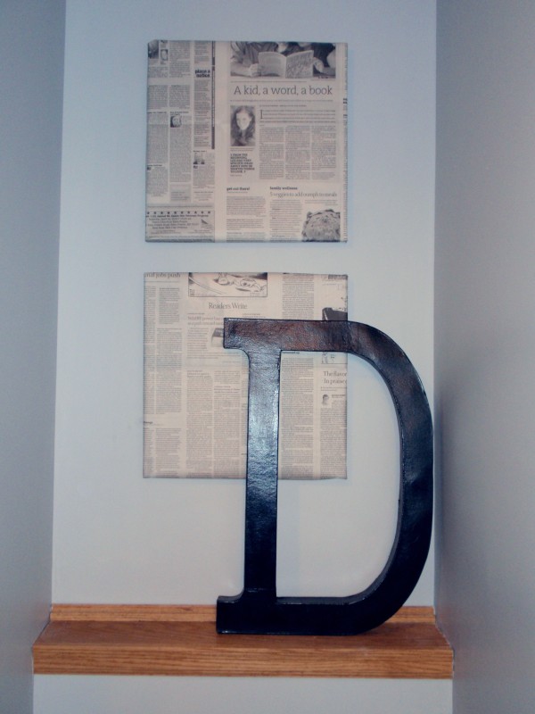
When I think of fonts, the first thing that pops into my head is newspaper. So, I took our Sunday paper (after we had finished reading it of course) and wrapped it around the two canvases. I held the paper in place with tape. The canvases are fine underneath, so I can always go back to them if I want. In the meantime, though, I have free art.
I picked up the “D” from JoAnn fabrics for $9. It was paper mache; I just painted it with some black paint we had around the house. So, for $9 this corner is now quirky and fits the room.
There were still a few touches to add.
I picked up a custom vinyl wall cling from Belvedere Designs.
And, I picked up a clock from Target so we could keep track of time while giving Edward his bath.
I think it is perfecto for a little boy’s bath. What do you think?
~ Anne


Great ideas and price. Not only a nice touch for a young person but I can see several years of growth with your changes. First again, I must be getting up too early.
I really like what you’ve done, but I personally (doesn’t make it right) think more black is needed in the vicinity of “newspapered” canvases. The black “D” seems overpowering, but don’t remove it. Maybe fake black frames even placed on the wall around the canvases, with space between the newspaper and the wall frames? Just some crazy thoughts 🙂 I continue to look forward to your blog daily. One of my only breaks during the day, and you give me good ideas!!!
I love the wall clings, and the shower curtain is great. The texture looks very inviting, like you want to feel it. At least, I want to feel it.
Not at all wild about the newspapers over the canvases, though. They kind of look like they’re covering up broken windows because no one has gotten around to replacing the glass for them yet. 😦
I really like it and my fav is the h20